Graphics
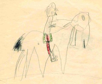
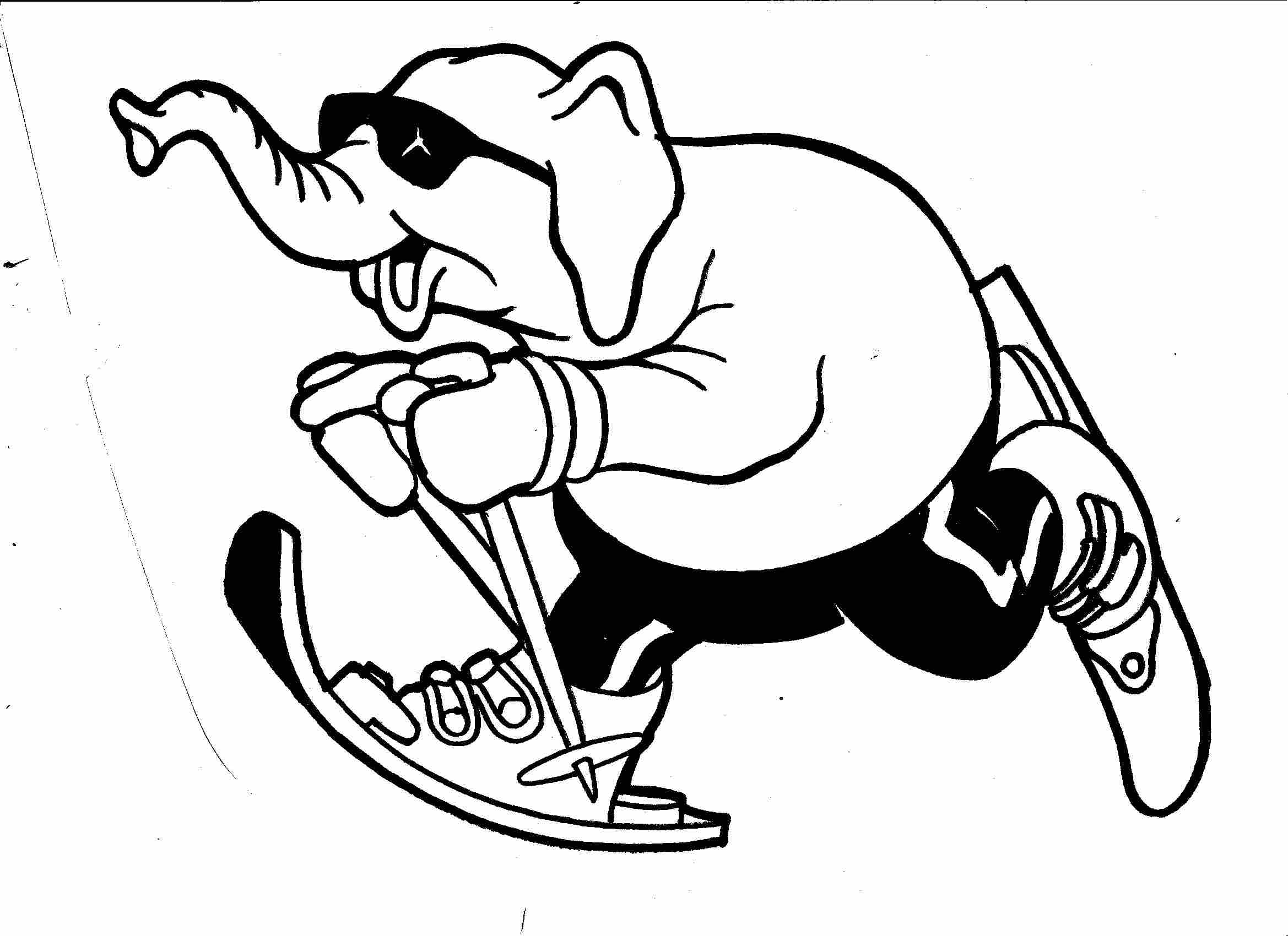
As a commercial artist I have produced thousands of illustrations, layouts, logos and other kinds of graphics of varying quality. Most of it is completely out of date and has been recycled into energy. This page starts with a work from my childhood. Like most children I was a big consumer of paper. That is still so.
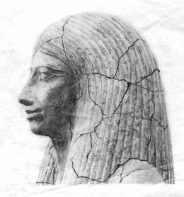
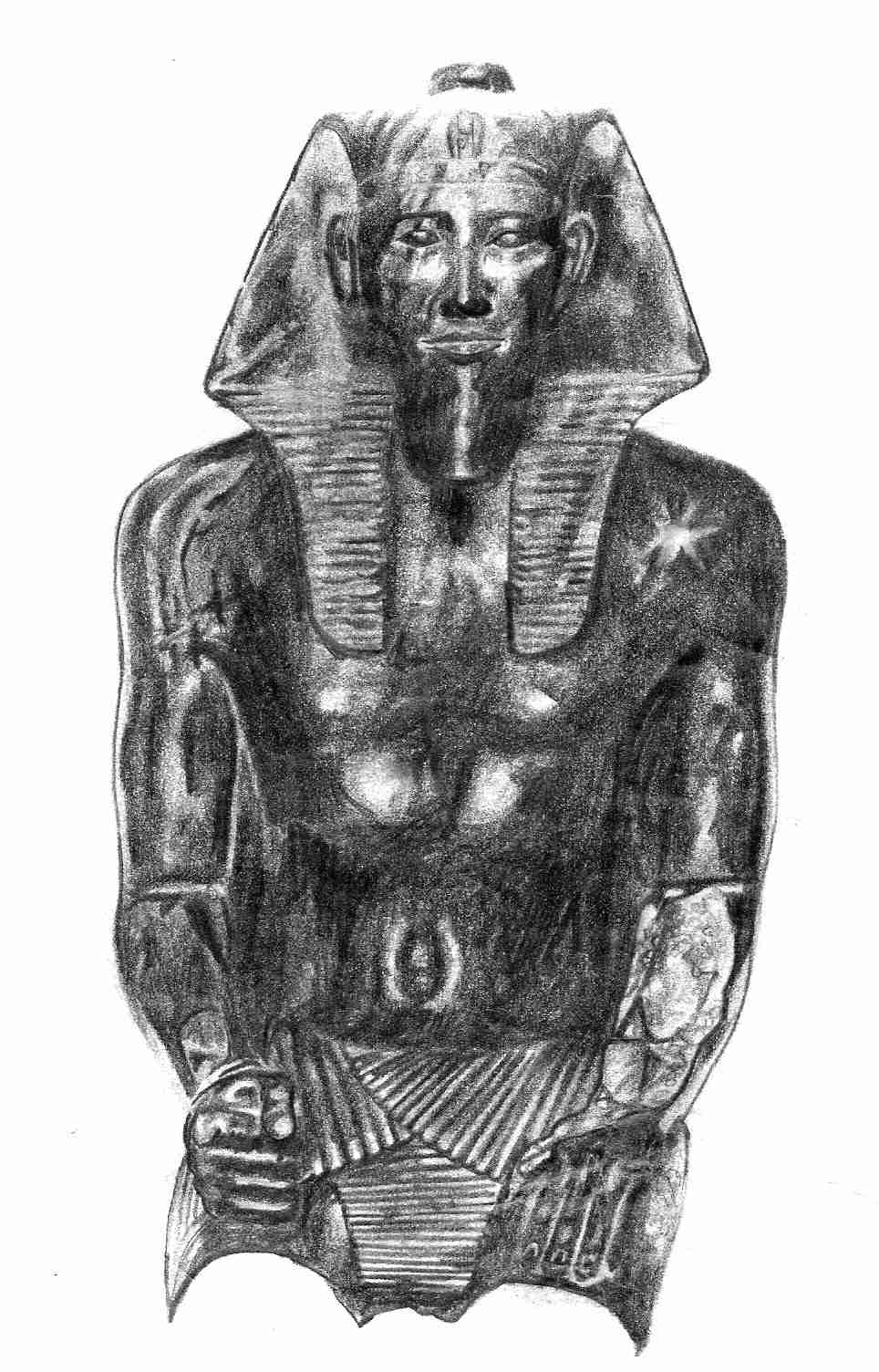
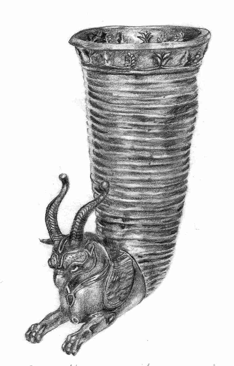
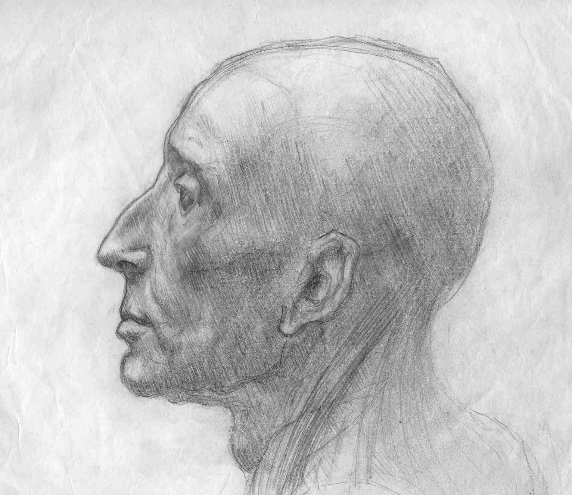
When I was about twenty I began to study art history at the University of Gothenburg, mainly because it was the easiest way to get a study loan. I soon got interested in certain objects from the history of art, and in order to get a deeper understanding of those beautiful things I began to copy photos of them from books with lead pencil on paper. Mostly I drew the pictures in reverse just for practice.
The drawing to the left is about 10 cm high. I made lots of such pictures, all very meticulous. Through this training in observing and sketching my old interest in drawing was again awakened.
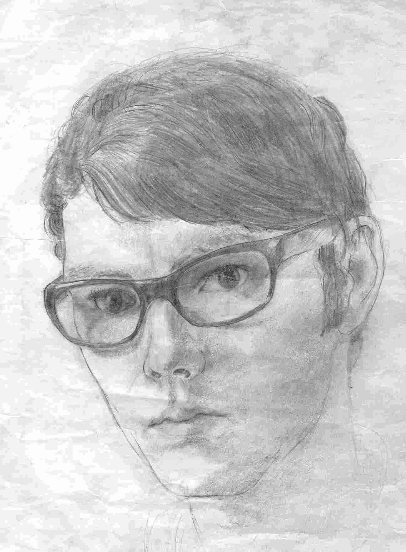
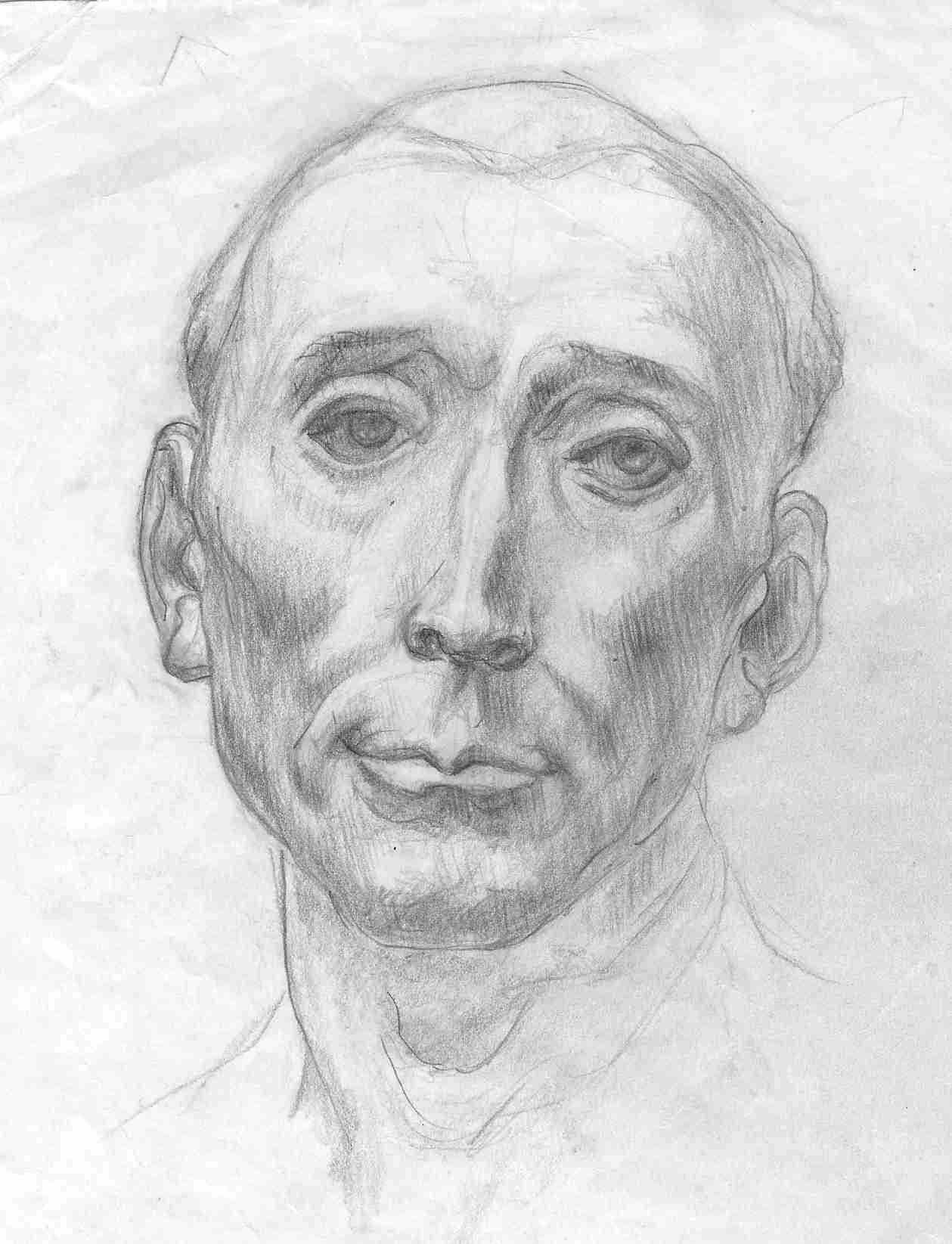
My friends soon got bored of modeling for me so instead I made some self-portraits. My real father (at that time I didn´t know he was), an established painter of portraits and landscapes, said that I had got all the family traits in the right way. He knew what he was talking about.
The left eye on the drawing to the right is correctly drawn after the mirror image. Since I was a teenager I have faced the world with only one eye.
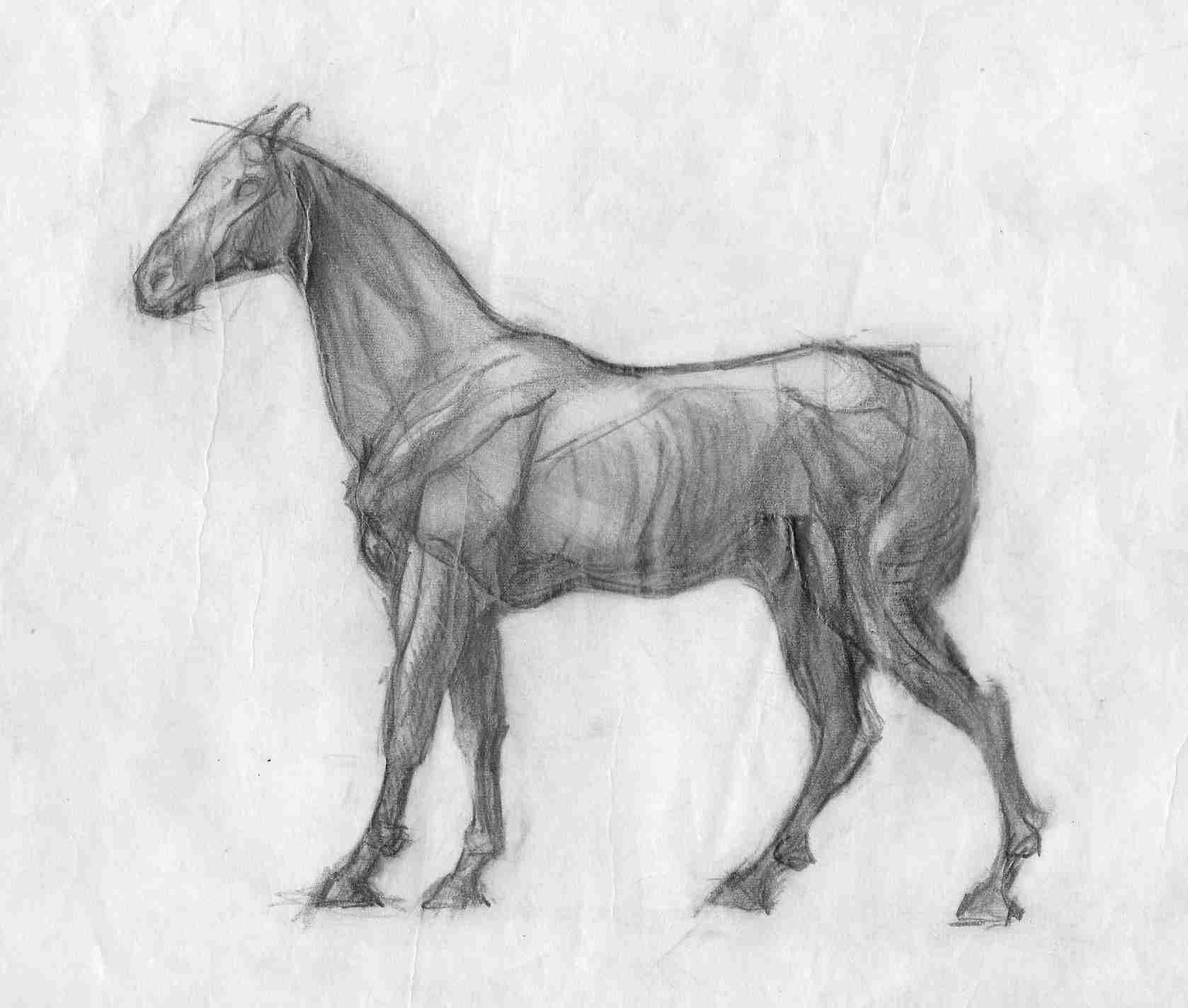
Very soon I had had enough of selfies. My mother suggested that I should go to the school of industrial art in our home town, where you could find plaster figures of men and animals. There I began to draw seriously.
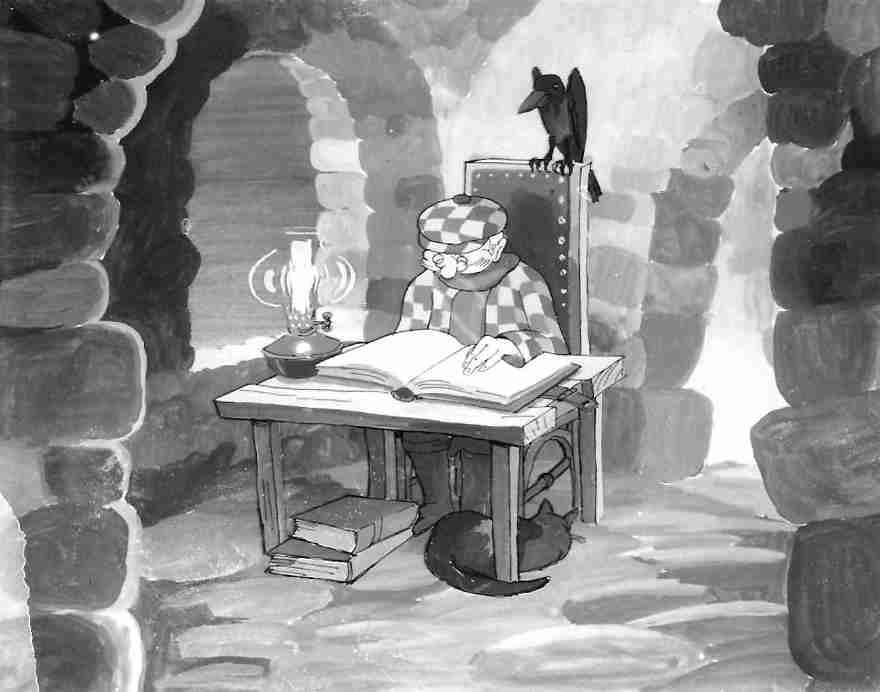
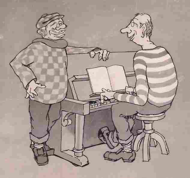
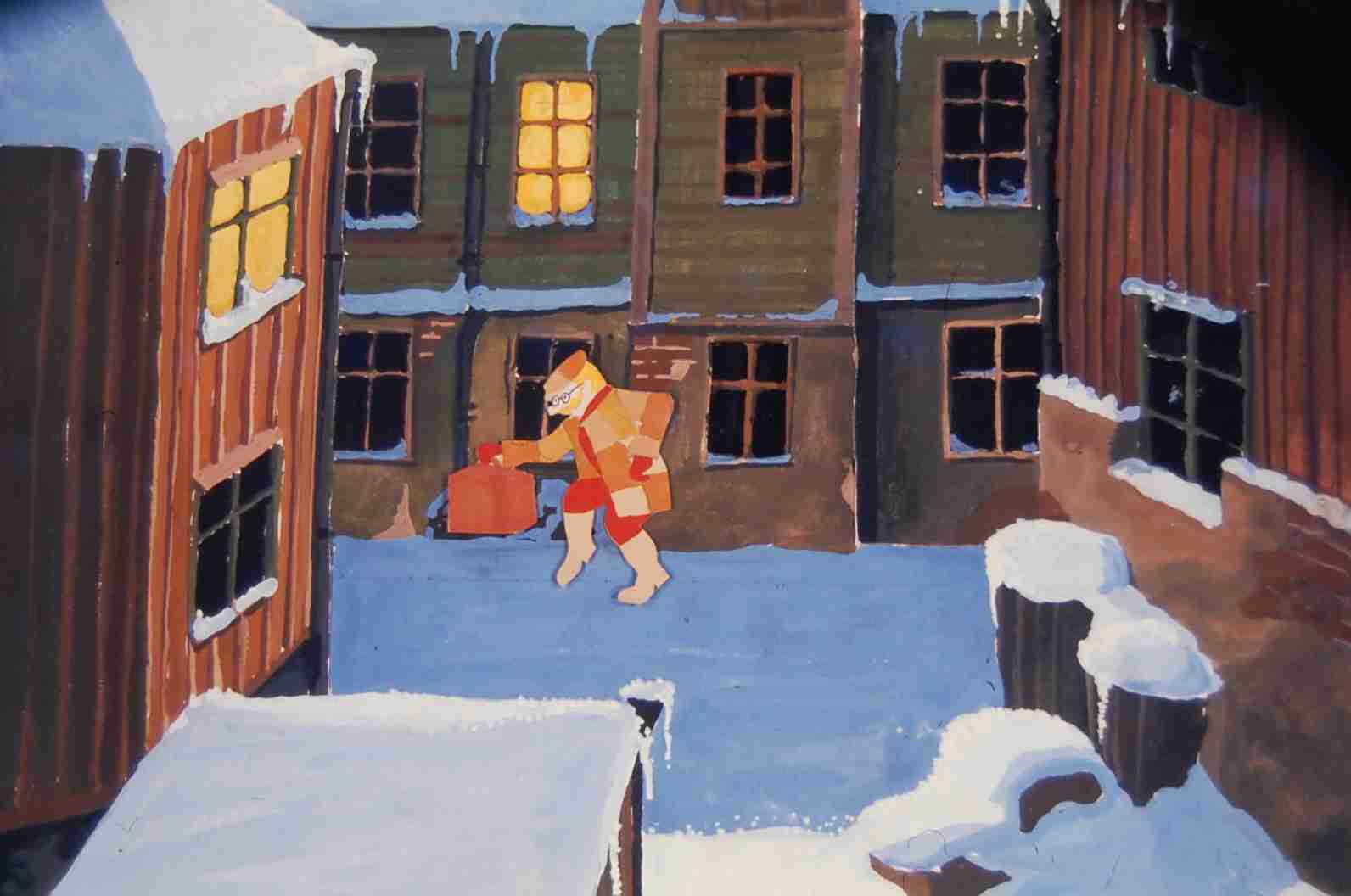
After four years at the art school I started as a commercial artist in business advertising. Then I was trapped by the Swedish television company where I stayed for ten years making drawings and all sorts of graphics for that medium. I also made a lot of film animations, models for trick camera takes and even scenography. The salary was miserable, but I had a very good time. The pictures below are stills from animations in programmes for elderly people.
In my spare time I made other things, for instance the following ones:
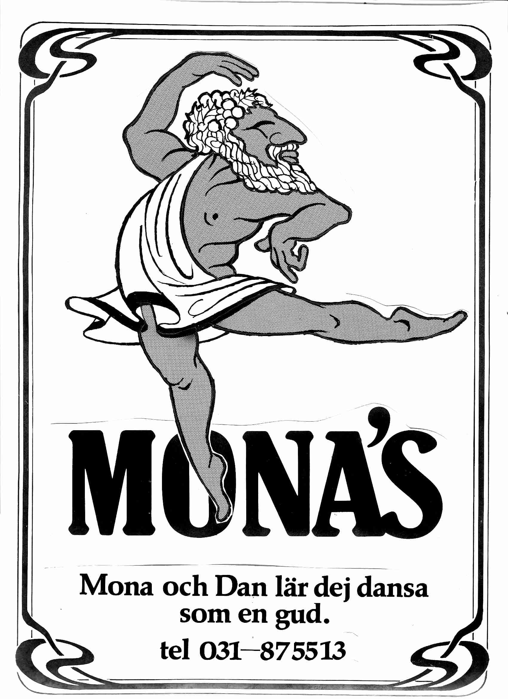
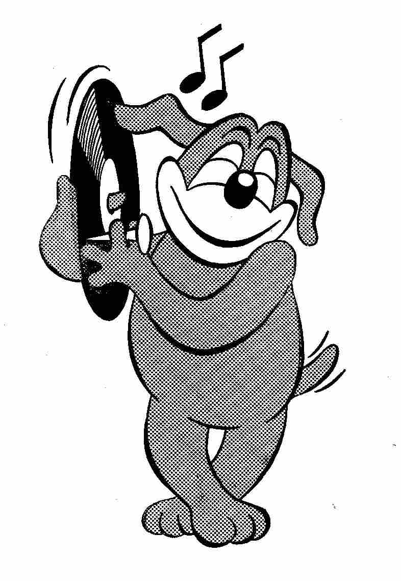

As a member of a jazz band I did the items to the right for free.
I played the trombone..

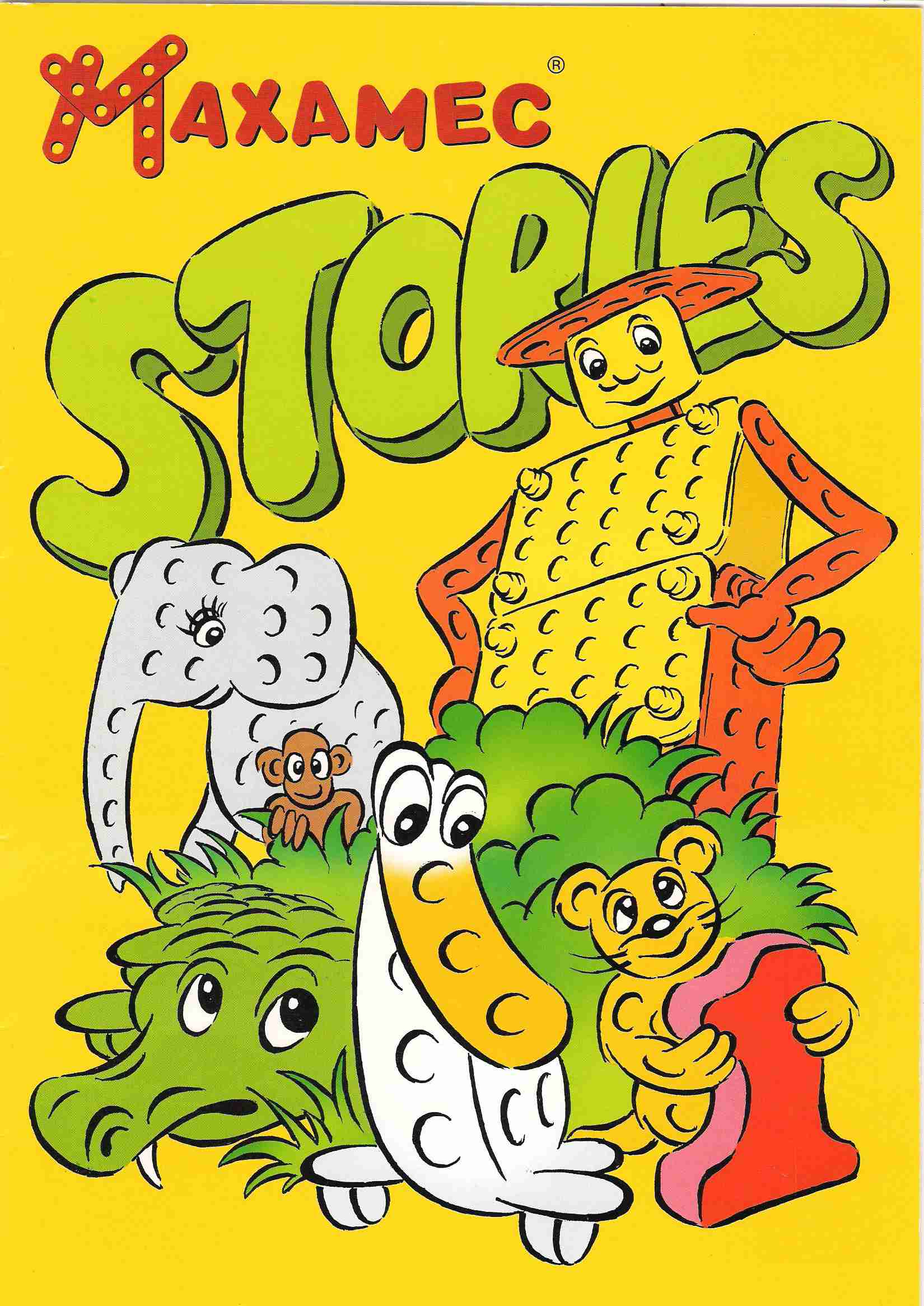
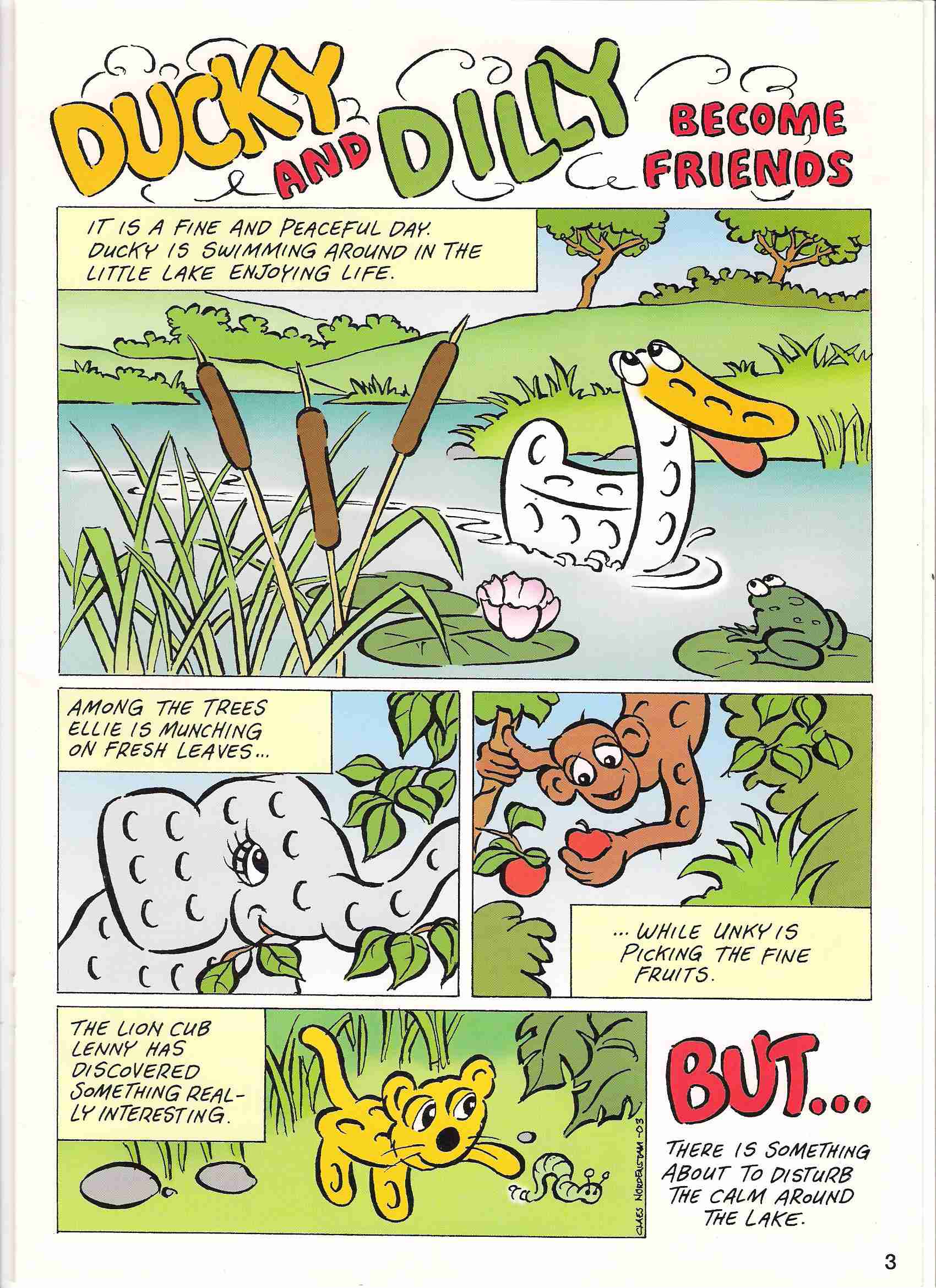
To support the marketing of Maxamec I created a comic paper. The characters were intended to have a graphic similarity to the toys with their perforated boards, in addition to having a good moral influence on the children. Here are some pages from the first and only issue of that paper. To see the whole story click here.

With a little help from my computer
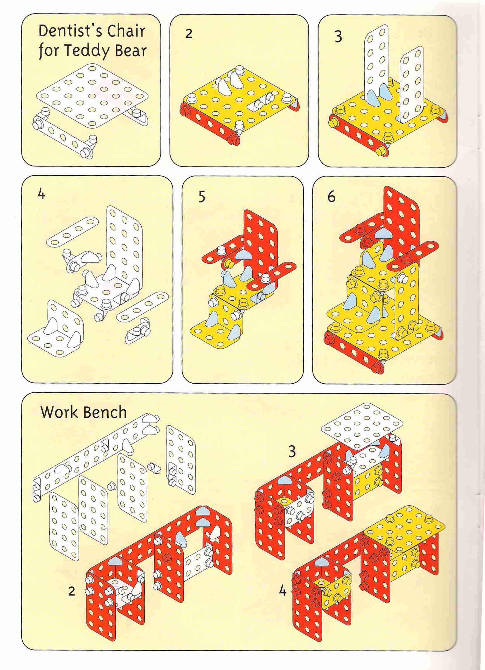
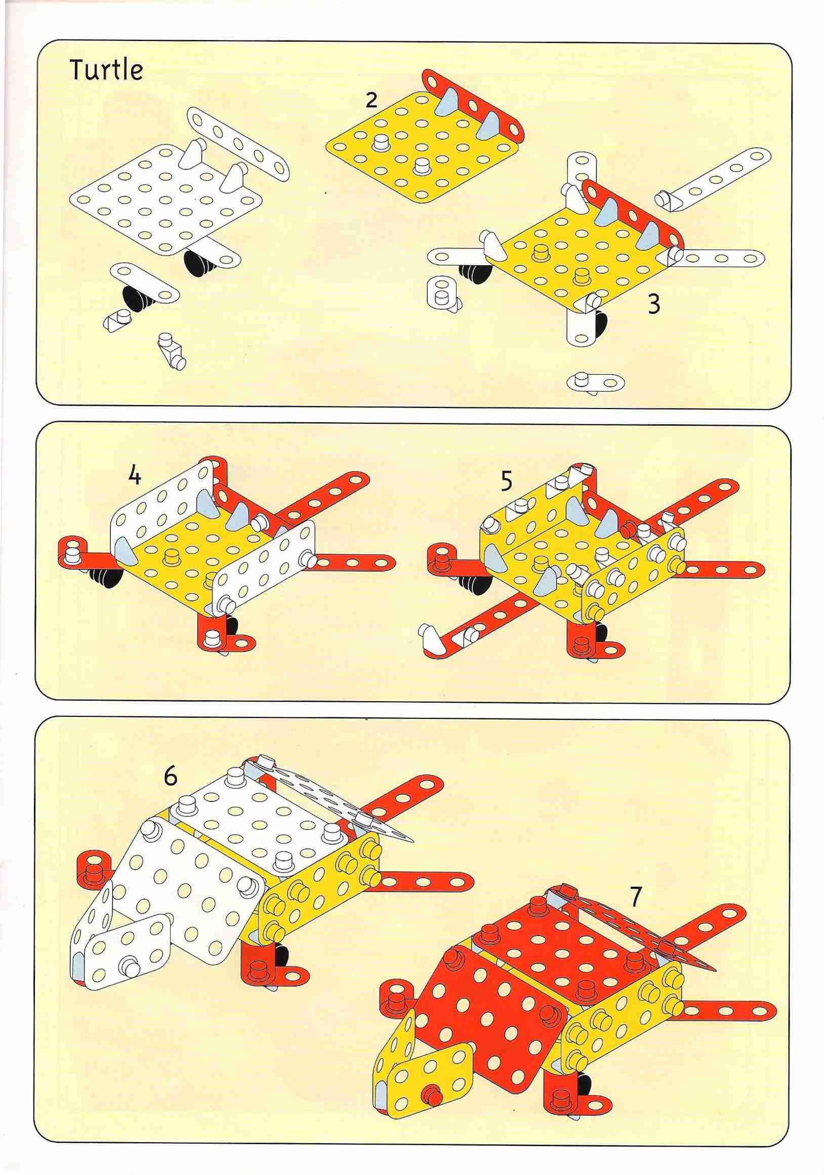
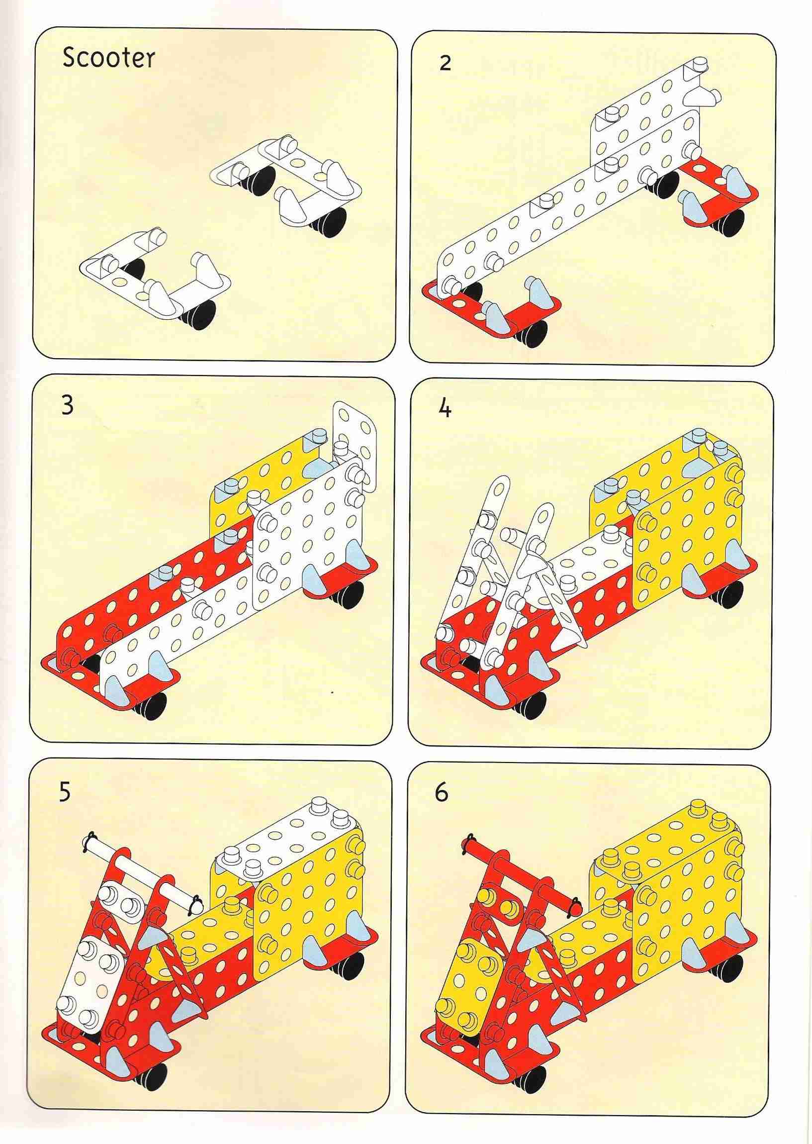
During the development of Maxamec I designed hundreds of different models as inspiration for the children. The instructions were as important as the toys themselves. The problem was to find a way of illustrating this so the children could understand it. At last I found a simple way to do it using a flat drawing programme (Freehand from Macromedia), in a perspective where all the parts had the same size independent of the distance in depth. Here are some examples.
Typography
In the art school I got interested in letter design thanks to a very inspiring teacher, Erik Lindegren, a gifted lettering artist and author of several books on the subject. Some years later I made my first typeface, called Quickstep. The idea behind it was to make something similar to antiqua typefaces without using thin hairlines. I made two variants, normal and bold.
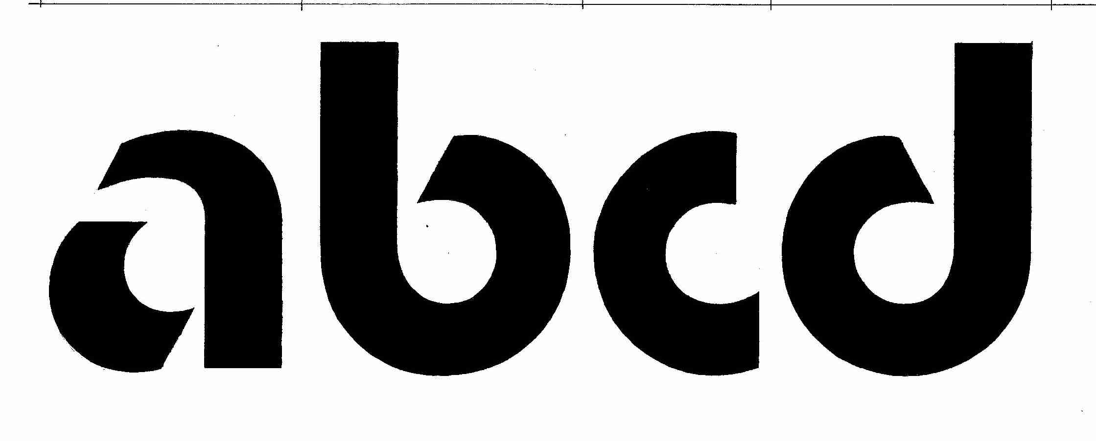
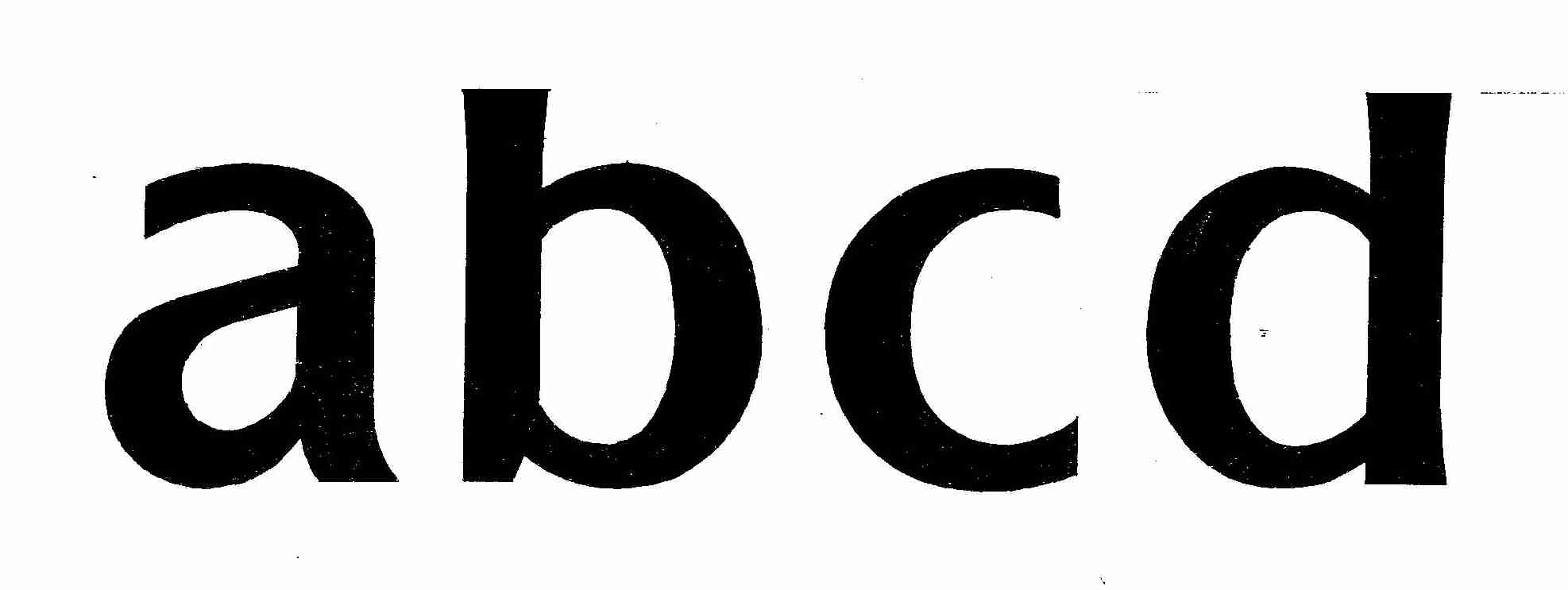
As a project on my own I started to sketch an ideal typeface for road signs. In Sweden the place-names on traffic signs are always written in capitals, which is a bad choice. The lack of ascenders and descenders destroys shape recognition of the words and makes the text more difficult to read. My sketch uses both caps and lower cases, and the stems are short compared to the x-high. The result is that the surface of the sign can be used in a more efficient way. But the Swedish Transport Administration turned out to be a very conservative organisation with little interest in new and better ideas.
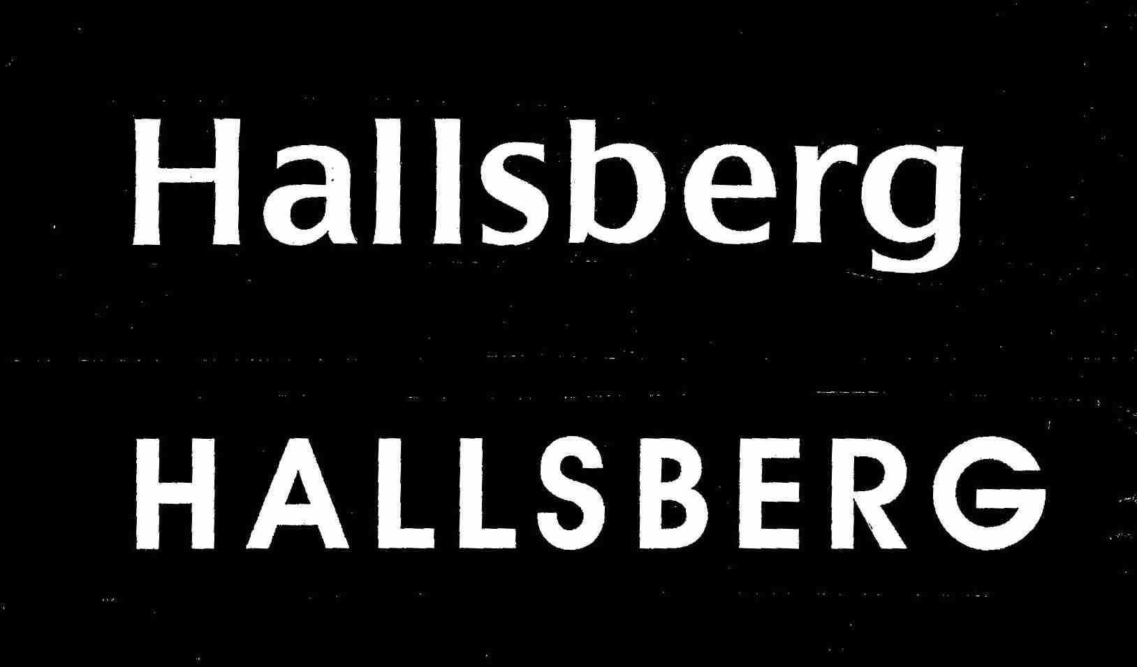
When I worked as a consultant for the public transport company in Gothenburg, the marketing director and I agreed that the legibility of the electronic signs they used at that time was far too low, a clear case of design without graphic competence. For many years I worked on the project of creating new typefaces for electronic signs of all kinds. Now they ared used on all electronic signs in public transport in West Sweden. It is difficult to expand the market for my design because typography is a subject that is fully comprehensible only for specialists. But I do hope the example below will illustrate the advantage of using knowledge in typographic design. I tried later to make the manufacturer and supplier of those signs interested in the new alternatives, but they were fully satisfied with their own design – the one to the left.
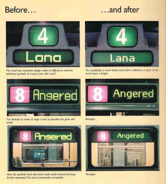
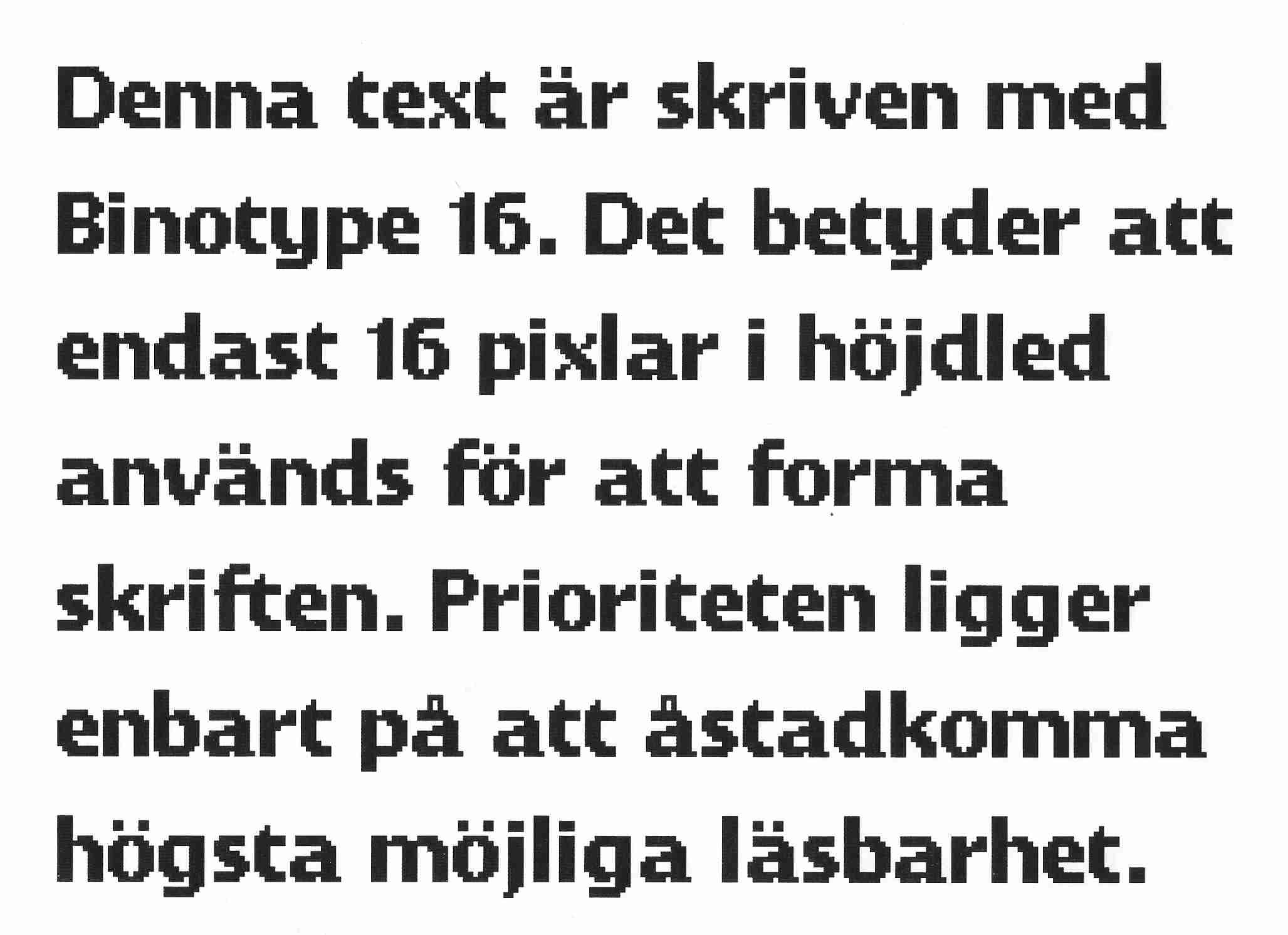
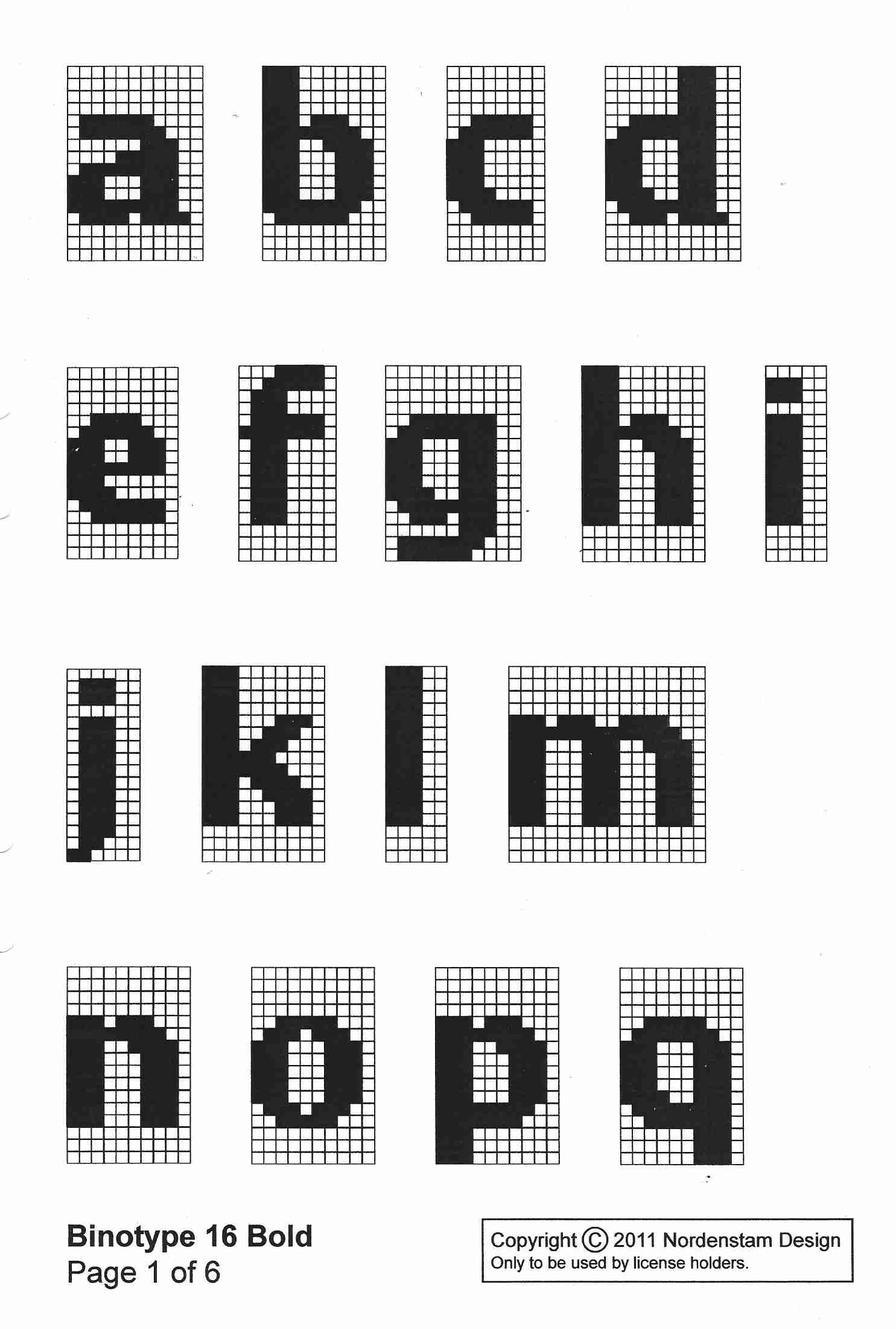
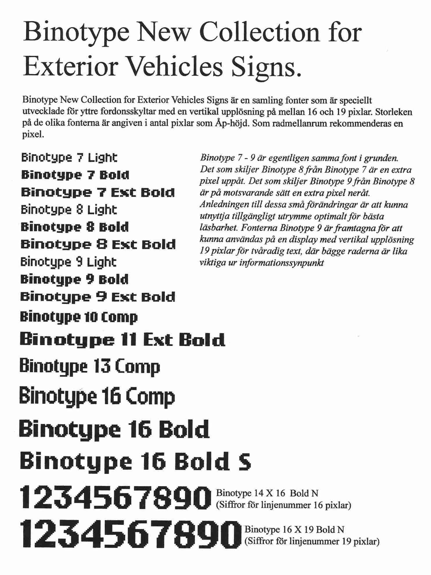
Soon I realized that this was virgin territory for design. Neither purchasers nor designers and manufacturers had shown any interest in increasing the legibility of electronic signs. I have given the new field a name, Binary Typography. I registrated a trademark, Binotype, and over the years I created a collection of typefaces for various purposes. The picture to the left is a sample of Binotype 16 Bold. The total height of the characters is 16 pixels. The picture in the middle shows how the characters are defined. I also made a collection of Binotype typefaces which are particularly suitable for exterior signs on vehicles.
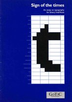
JFor marketing purposes I wrote an essay called ”Signs of the times” which was published by GOTIC, Gothenburg Trafic Information Centre. Press here for the PDF.
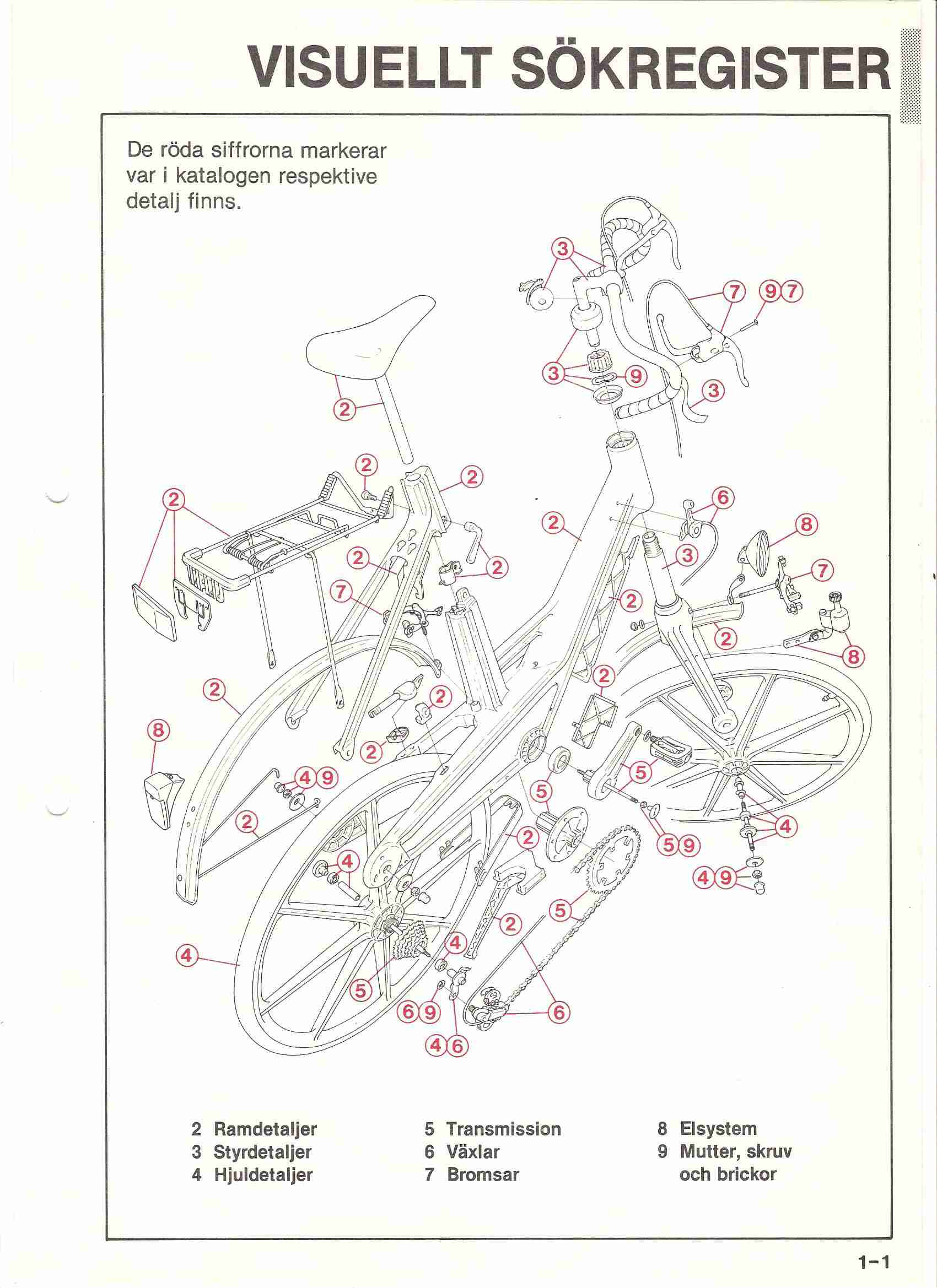
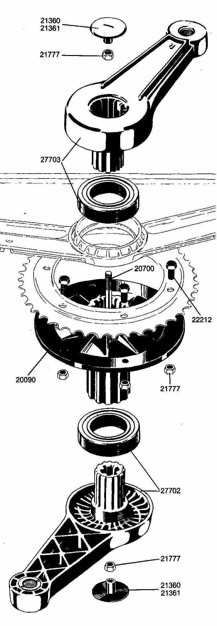
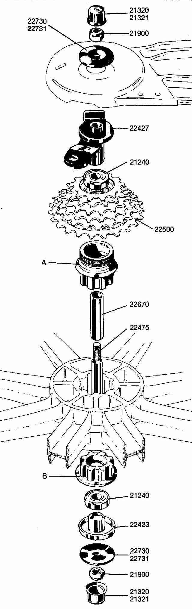
Industrial drawings
For some years I was employed by Itera, the company for the plastic bicycle. My role here was development, publicity and design. Amongst other things I produced a complete catalogue for spare parts. Here are some examples from those 30 pages.